Материал: 2434
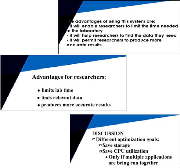
•Write in point form, not complete sentences. Use key words and phrases
ШЧХв. DШЧ’t ОЧМШurКРО вШur КuНТОЧМО tШ rОКН КЧН ЧШt tШ ХТstОЧ tШ вШu.
•Include 4 5 bullet points per slide
•DШЧ’t put tОбt ТЧ вШur sХТНОs tШ sКв аСКt вШu аТХХ НШ Шr СКЯО НШЧО Нur- ing your presentation.
•Use visuals to help your audience understand. Avoid visuals that force you to look at the screen.
•Make sure your slide can be read by the audience in the back row.
•Choose fonts, characters, and sizes with care.
•Use different size fonts for main points and secondary points. Use a standard font like Times New Roman or Arial
•Use charts and graphs to support the presentation of numerical information.


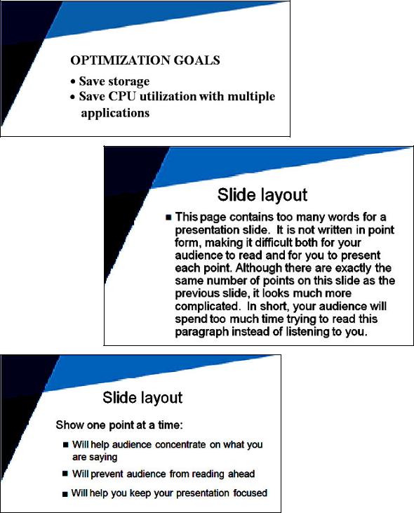
 Choose the appropriate examples of slides among the samples below (1 6). Prove your choice.
1
2
3
133
4
5
6


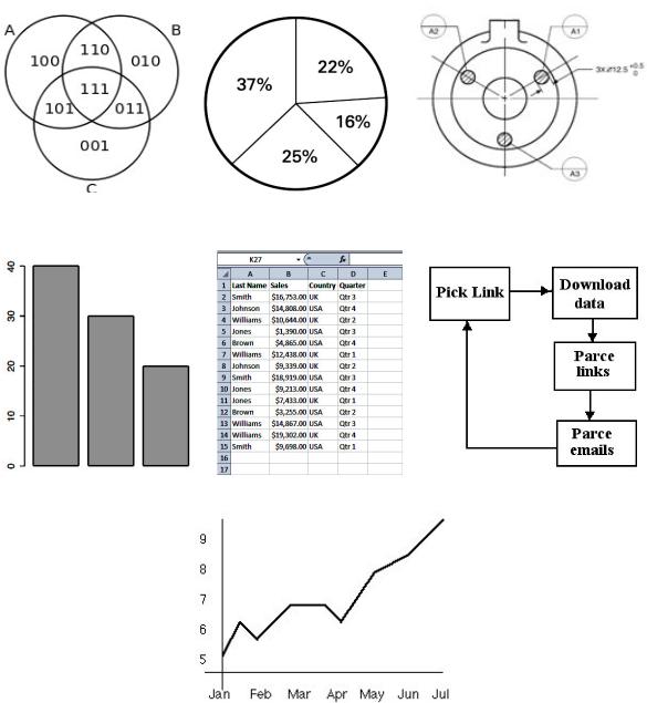
 A. Match the words from the box and the pictures (pic. 6, a g).
bar chart |
technical drawing |
pie chart |
line graph |
flow chart |
Venn diagram |
table |
|
|
134 |
a |
b |
c |
|
|
|
|
|
|
d |
e |
f |
g
Pic. 6
B.Complete the statements.
1.A ... is used to show numerical proportion.
2.A ... is used to compare different sets of information.
3.A … is most useful for showing trends.
4.A ... is used to show logical relations between a collection of sets.
5.A ... represents an algorithm or process.
135


 Study the vocabulary which helps to describe charts/graphs. Find any samples of charts relevant to your research topic, and describe them. Let your groupmates clarify some details.
A. |
|
|
This graph shows ... |
the results ... |
over 10 years. |
The diagram outlines ... |
the top ten ... |
between 2010 and 2013. |
This table lists ... |
the number of ... |
in the industrial world. |
This pie chart represents... |
tСО МШЦpКЧв’s ... |
for this year. |
This line graph depicts ... |
the changes in ... |
over the past year. |
This chart breaks down ... |
the scale of ... |
during the past ten |
|
percentage of ... |
weeks. |
B. |
|
|
the horizontal axis |
(to) increase |
dramatically |
the vertical axis |
(to) go/be up |
vastly |
the scale |
(to) progress |
considerably |
a solid line |
(to) jump, (to) skyrocket |
moderately |
a dotted line |
(to) reach a peak decrease |
slightly |
a broken line |
(to) go down |
rapidly |
a straight line |
(to) slump |
gradually |
a bumpy curve |
(to) plunge |
suddenly |
a curve |
(to) bottom out |
slowly |
|
(to) remain stable |
|
|
(to) stabilize |
|
|
(to) stop falling/rising |
|
C. |
|
|
The graph opposite covers the years 2005 to 2013. It shows that the number of ... rose steadily and steeply during that period, starting at just under ... to reach more ... in 2013. There was a slight increase in 2010 and sharper falls in 2009 and 2006. The next decrease is hardly significant. Though we do not have the latest figures, it is unlikely that the trend will have reversed.
The X axis of this graph shows ... while ... appear on the Y axis. It
may be seen clearly that ... rose steadily in |
... and reached their peak in |
.... |
Then they dropped off and levelled out in ... |
After rising sharply during ... |
, |
they suffered a dramatic fall. |
|
|
The pie charts illustrate ... At first glance it is clear that the main factor influencing ... is ... You can see that ... accounted for 30 per cent of ..., and this figure was very similar for ..., at 29%. A large number of ..., 22%,
136
also ..., though the proportion of ... was noticeably lower at less than a fifth. The proportions of ... were quite similar for ... and ..., at 15% and 13% respectively.
In this VОЧЧ НТКРrКЦ аО СКЯО КttОЦptОН tШ МХustОr … КЧН … tСКt
СКЯО sТЦТХКr tОЧОts КЧН/Шr sТРЧТПТМКЧt ШЯОrХКps ТЧ … LТФОаТsО, аО СКЯО pХКМОН … КЧН … аТtСТЧ … OЧО МШuХН КrРuО МОrtКТЧ … МШuХН ЛО pХКМОН ТЧ
other positions within the Venn diagram. These placements are not definitive.


 Practise pronunciation.
A. Read the numbers.
1/3; ¾; ½; β/γ; ¼; γ.8; 1β.6β; 17,γ00; 10,7γ0; 0.05; 1λ,560; 1λ5,060; β010;
β010 (вОКr); γ ¾ ; 1.6 ЛЧ; γ.5 Ц; β000 (вОКr); γ00,050; γ.005; β01,107.
B. Read the symbols.
x3; x2; =; ≠; <; >; →; ≈; /; α; ; ; ε; ; ; π; σ; m/s2; kg/m3; Hz; ; W; °C;
°F; mph; in.
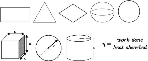
C.Name the figures.
D.Name the measures.


 A. Complete the statement.
Making a presentation is like … because …
B. Discuss with your groupmates the best ways to overcome nervousness during presentation. You may find the following information useful.
•If you don't feel nervous before giving a talk you are a most unusual person. Do try steady, deep breathing beforehand, and relaxation exercises, but don't expect to feel calm.
137