Материал: Uchebnik_dlya_sud_expertov
Внимание! Если размещение файла нарушает Ваши авторские права, то обязательно сообщите нам

4. How close together are your lines of writing?

Very far apart - indicates that you are isolated, detached and reserved.

Apart far enough that letters do not touch - indicates that you enjoy social interactions and are talkative.

Close enough so that the descendants touch the ascendants - indicates that you like to be organized. 5. What color ink did you choose?

Blue black - indicates that you are rational and conservative. You adhere to conventions and traditions.

Red - indicates that you are spiritual rather than material, and may have a deep understanding of other people's problems.

Light blue - indicates that you are strong, vital, energetic and affectionate. You also have an original approach.

6. How large was your capital I in the sample?

Larger than the other capital letters - indicates that you are a person with a high opinion of yourself, or who wants others to think that you do.

Smaller than other capitals - indicates that you are well adjusted and harmonious, a person content with your current role.

7. What do your t bars look like?

Crossbars tend to be to the left of the stem of the 't' - indicates that you are cautious, possibly uncertain about things.

Cross the 't' more or less in the middle - indicates that you are not very original but quite responsible.

Crossbars tend to be to the right of the stem of the 't' - indicates that you are reliable and conscientious with leadership qualities.

8. Your writing slopes,

Upward - indicates that you are energetic, optimistic, and assertive. Downward - indicates that you are steadfast, purposeful, and possibly aloof.

9. Which takes the most space vertically in a line of your writing?

The ascenders - indicates that you are idealistic, ambitious, and intuitive.

The middle zone letters - indicates that you are a materialist, and prone to exaggeration. The descenders - indicates that you have a tendency to be bossy.

10. How much pressure does your writing show?

Fine and spidery - indicates that you are a person of sensitivity, refinement, modesty, and spirituality. You may also be overly critical and austere.

Firm and even - indicates that you are a person of strong but rigid will, obstinate but powerful. Heavy - indicates that you are a person of energy and elasticity, able to roll with the punches and adapt to whatever life brings.

7..

1.# — $& " " ).

2.$, & & " @ ( , ) > $ 4000 .

321

3.


,

&$ $ -


&

# = @-


3 ) (1806-1881).


4.

# " $ , ! C!, -


, %

,


& , .C, '. , .


/ $ , . , = & , !.> .


5.

2$

" & $ -


.

6.

+ , «

», , -


, , $, $, ,

, &

.

7.& & $ $) $ % $- ) $) &.

8.# % ) $ " -

, , C!.

9., #: : ( $ -$ , $ , , ); : ( " , ", " , " ); : (, , ).

10. C! ) $ # , -# $ -& .

8. $# # -, <), 5 )!. /

, , -

$ , , ' # (

. # -

.

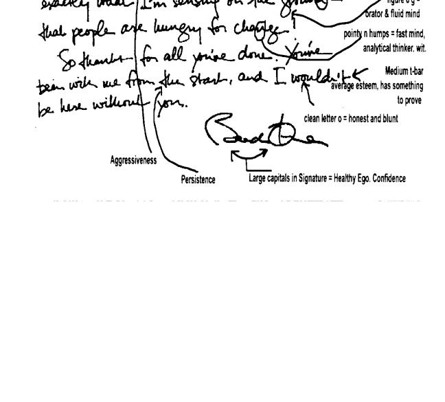
Handwriting analysis of US President Obama reveals at least nine characteristics common place among previous world renowned leaders of commerce, politics, and the arts.

*Large capital letters in signature show a healthy ego, confidence;

*An open loop on the letter h indicates a mind open to different philosophies;

*The short stem on the d's reveals an independent thinker;

*A figure-8 shaped g designates one with fluid thinking; and

*A clean letter points out his openness and bluntness.

322

A person's handwriting is as unique as their personality, and there's good reason to look for traces of their personality in their handwriting. Have you ever wanted to analyze handwriting? Here's how to start your lucrative career in graphology

Look at the pressure of the strokes. A high pressure means the person has a high Emotional Energy. People with a high Emotional Energy have a lot of enthusiasm for life and are often very successful. People with a low Emotional Energy find most situations draining and will try to avoid them.

Look at the size of the letters. Large letters mean the person is outgoing and extraverted; small letters mean the person is reclusive and introverted. There are many aspects to the size of writing and alone it doesn’t indicate many things. Size (and especially the relative size of letter parts) needs to be considered along with other factors. There are some simple indicators however. Small writing is generally a strong indicator of a detailed, technical personality. Large rounded and dominant central case letters indicate a friendly and sociable personality.

Look at the slope of the strokes. Is there a consistent slope to the letters and therefore the words in the sample? Check by drawing lines through the up and downward strokes. Backwards slopes indicate an introverted personality; forward slopes are extraverted. Upright strokes indicate a personality who is motivated by factors other than people, (i.e. neither extrovert nor introvert). The

323
degree of slope reflects the degree of extraversion or introversion. The degree of consistency of the slope (i.e. parallel strokes) indicates the degree of emotional consistency.

Look at the line slope. Writing which rises to the right shows optimism and cheerfulness. Sagging to the right shows physical or mental weariness. (This applies to signatures slopingdownwards also.)

Look at the flow. One of the essential indicators, but like any other factor not to be used on its own. Generally, restraint is indicated every time the pen leaves the paper, and the converse applies. Gushing, eager, impulsive people have a more continuous flow of writing. Flowing writing has linked letters and sometimes linked words. Thoughtful, considered people will have fewer linked letters and no linked words. Artistic and conceptual people who like space and time around them will often have completely separated letters. (It follows that pressure at school on some children to ‘write joined-up’ - because the common view is that to do otherwise is ‘not grownup’ - is unnatural and often counter-productive. In any event continuity of flow does not correlate to intelligence.)

Look at the spacing. Space between words indicates social attitude to others. Close words are a sign of sociability. Large spaces between words indicate the person is comfortable alone, and may even distrust others. Spacing between letters shows artistic spatially aware character, (artists, etc.)

Look at the decoration and distortion. Don’t confuse the two. Decoration is intended; distorted is malformed and unintentional. Both are different to unfinished letters, which is a different indicator. Decoration is generally a sign that the writer wishes to be noticed more than he or she is at present. Malformed letters indicate a variety of things which must be dealt with individually. Unfinished words can be a sign of intelligence and impatience.

Look at some more characteristics of handwriting.

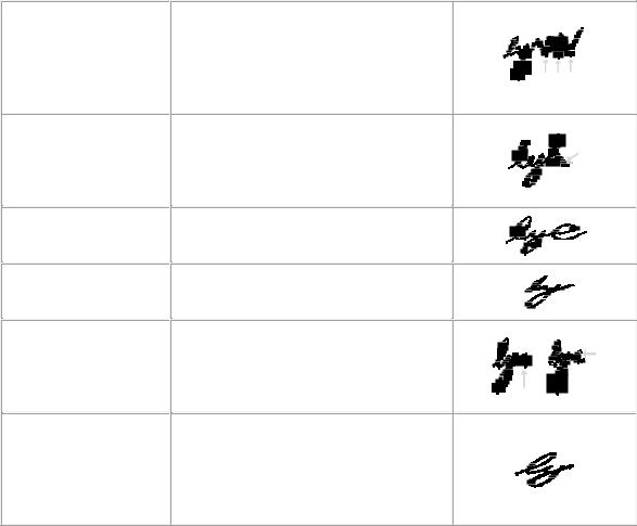
ANALYTICAL THINKINGv- wedges for m, n- bottom baseline intersections

BLUNT increasingly heavy downward and forward middle final

BROADMINDED wide e-loop

CONCENTRATION small writing

CULTURAL

REFINEMENT middle letter printed as capital

EMOTIONAL

INTENSITY,

MUCH

AVAILABLE heavy average stroke

sorts and separates information in assessing their value, evaluates information and supporting patterns

brings matters to a conclusion and thrusts it upon others

liberal self-viewpoints, free of bigotry

focuses attention on one activity ignoring all other influences

integration and discrimination of creative artistic and structural systems into one's mode of living

possesses strong libido and passions, abundance of available energy and vitality, proactive

324

pressure

FORGETFUL missing t-bars

HUMOUR initial wavy upper area down stroke to baseline

REBELLIOUS inflated triangular forward inverted upper circle

VANITY

tall t, d-stem height

inability to recall information or planned action, absentmindedness

the contrast between reality and assumed values provokes amusement

open hostility towards authority and for any form of discipline, belligerent

excessively high regard of ones conduct demonstrated through a sense of superiority

10. !! ( !

$ - -! ! ?

A doctor, found it easier to communicate with one of his elderly, hard-of- hearing patients by writing her notes. One day she came to the office for some test results. "Now, doctor," she said sternly, "If you have anything to tell me, please have your secretary type it. Frankly, your handwriting is worse than my hearing."

U.S. journalist and politician Horace Greeley was renowned for his illegible handwriting. He once wrote a note to a member of his staff on the New York Tribune, dismissing him for gross negligence of duty.

Meeting Greeley several years later, the journalist told his former chief how useful his note of dismissal had proved. “I took it with me,” he said. “Nobody could read it, so I declared it a letter of recommendation, gave it my own interpretation, and obtained several first-class situations by it. I am really very much obliged to you.”

325

Источник: https://studfile.net/preview/16694066/